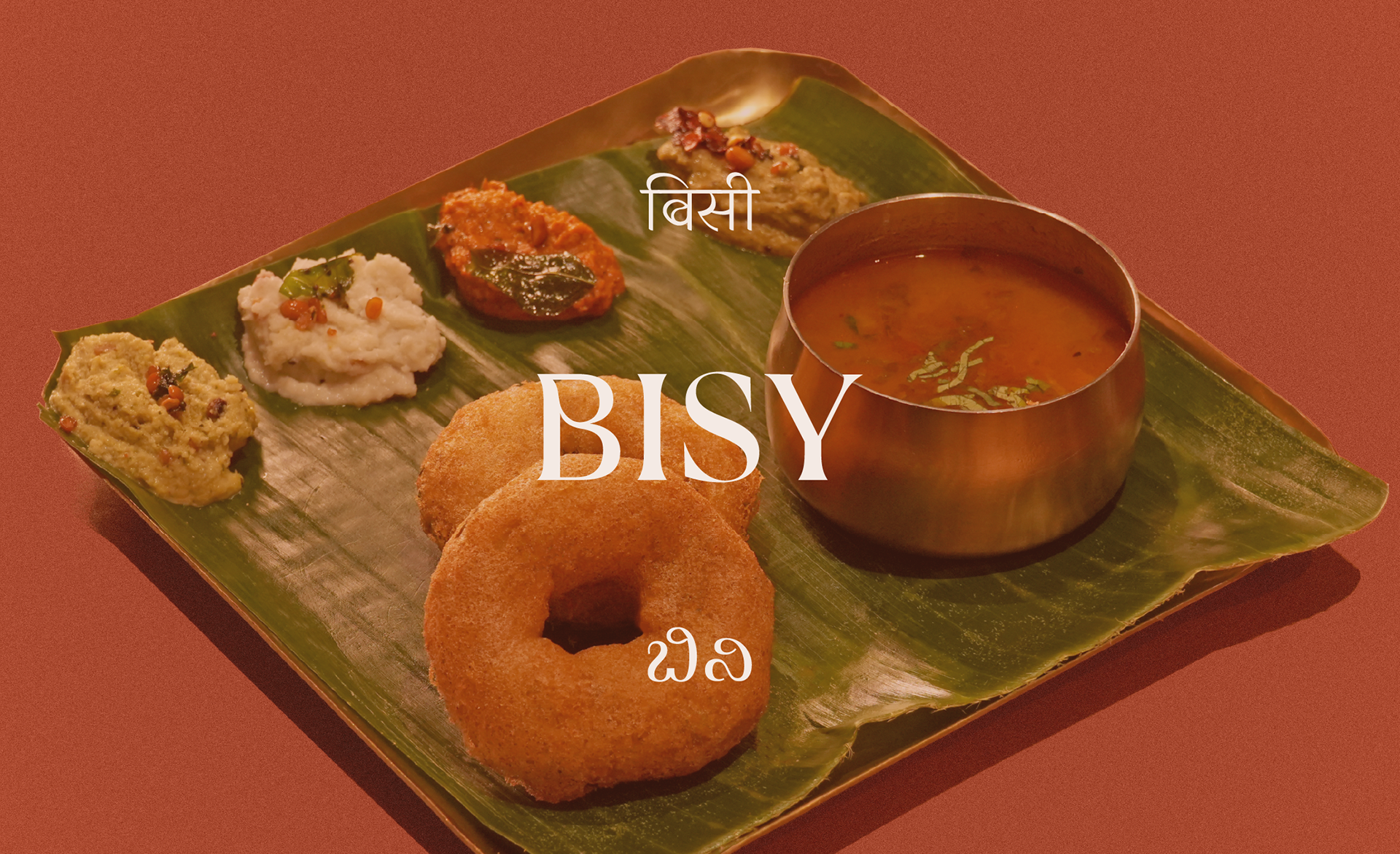
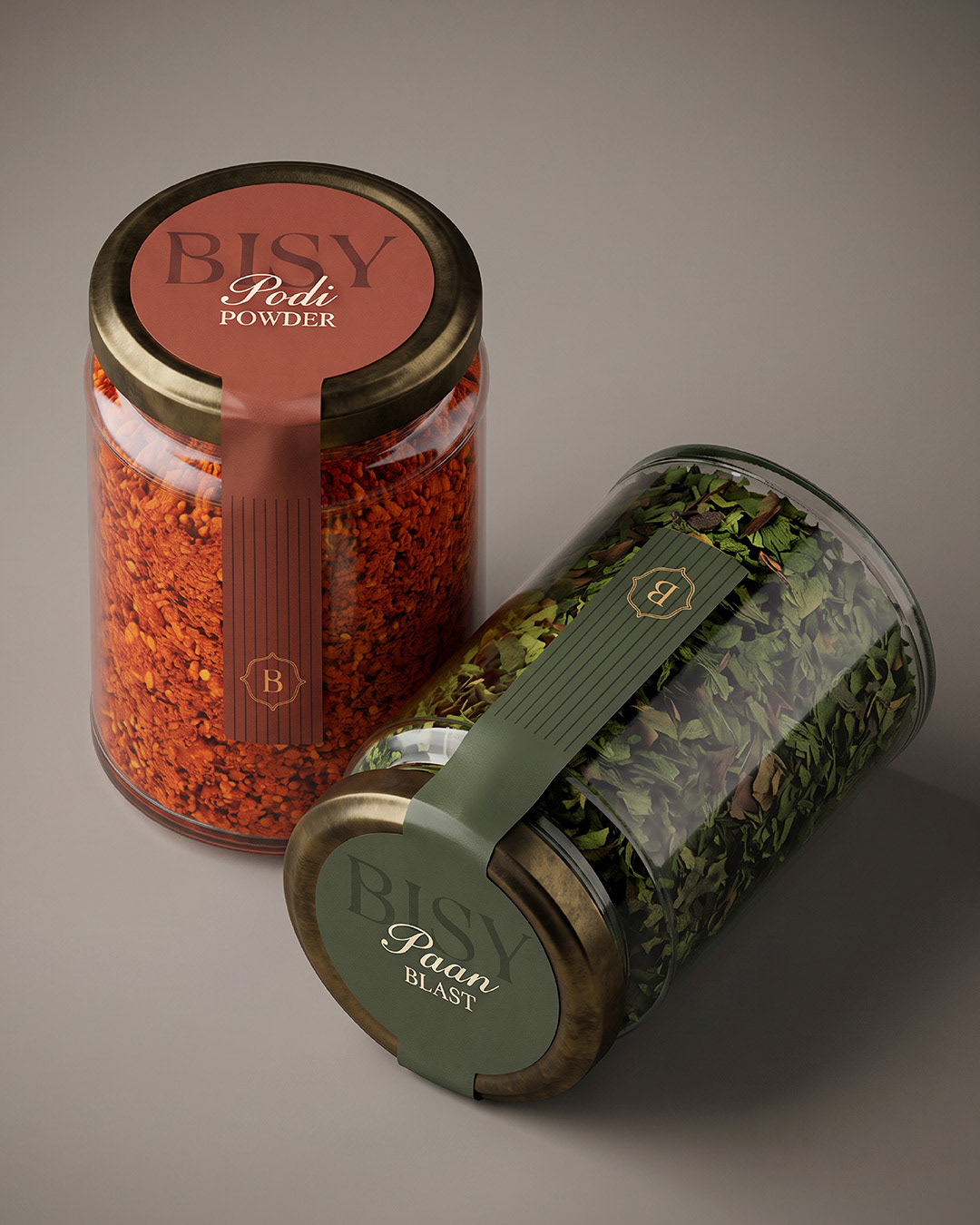
With the brand identity design for BISY, we wanted to create a shift in how people view South Indian food in Gurgaon. We wanted to make it feel fun, and fresh and modern - steering away from the existing South Indian chains, while still being deeply rooted in the ‘tiffin room’ culture.
BISY (or Bisi) means “hot” in Kannada, talking about the food, the warmth, the spice and the sexy 🌶️
BISY (or Bisi) means “hot” in Kannada, talking about the food, the warmth, the spice and the sexy 🌶️
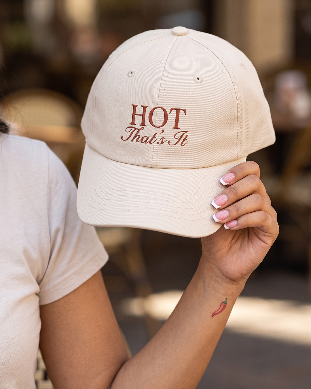
The tagline - HOT, That’s It - is reflective of that very feeling. Simple, sexy, no-frills.
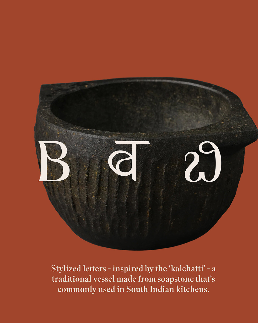

The primary logo is a wordmark that’s clean and fuss-free, with a custom ‘B’ inspired by the ‘kalchatti’ - a traditional soap stone vessel used in South Indian kitchens. We loved the texture of the soap stone and also created a texture inspired by it.
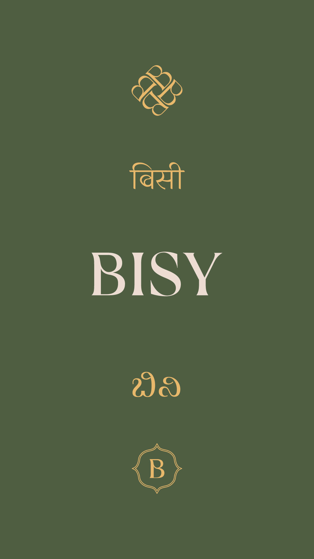
The secondary logos honour the shape while bringing a motif like element to the branding. The secondary logo with the 4 Bs repeated is a subtle nod to ‘Kolum’ art patterns.
We also designed Hindi and Kannada wordmarks with the same details as the ‘B’ in the english logo.
The secondary logos honour the shape while bringing a motif like element to the branding. The secondary logo with the 4 Bs repeated is a subtle nod to ‘Kolum’ art patterns.
We also designed Hindi and Kannada wordmarks with the same details as the ‘B’ in the english logo.
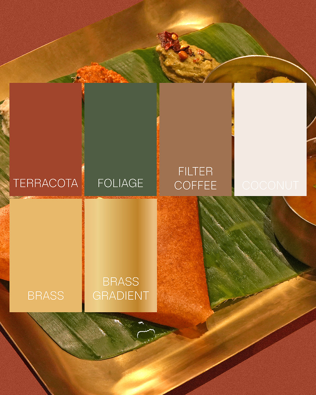
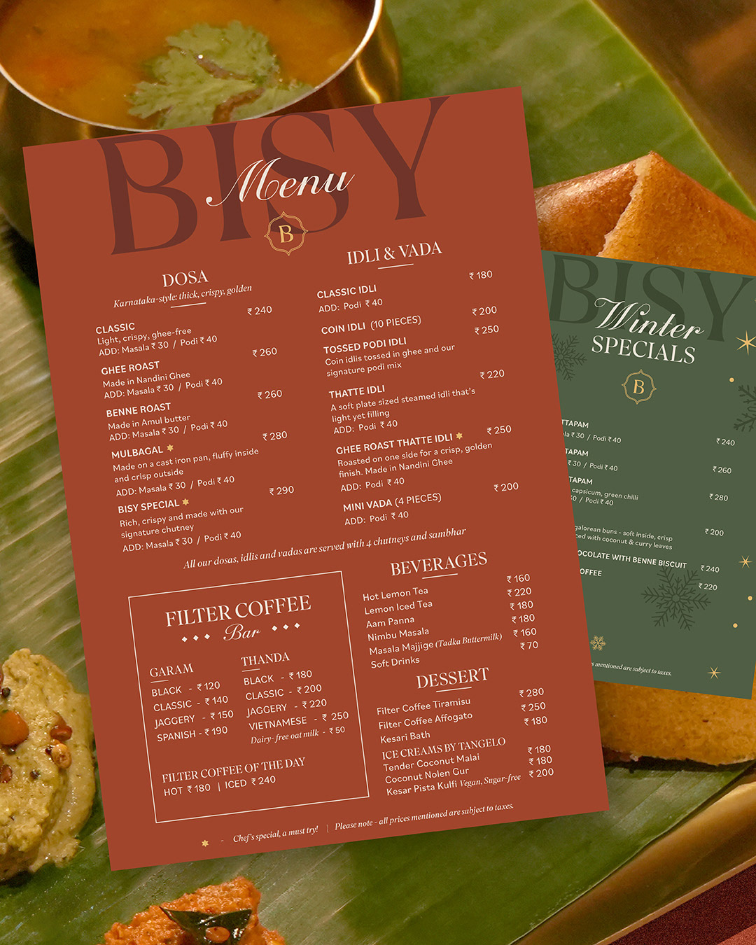
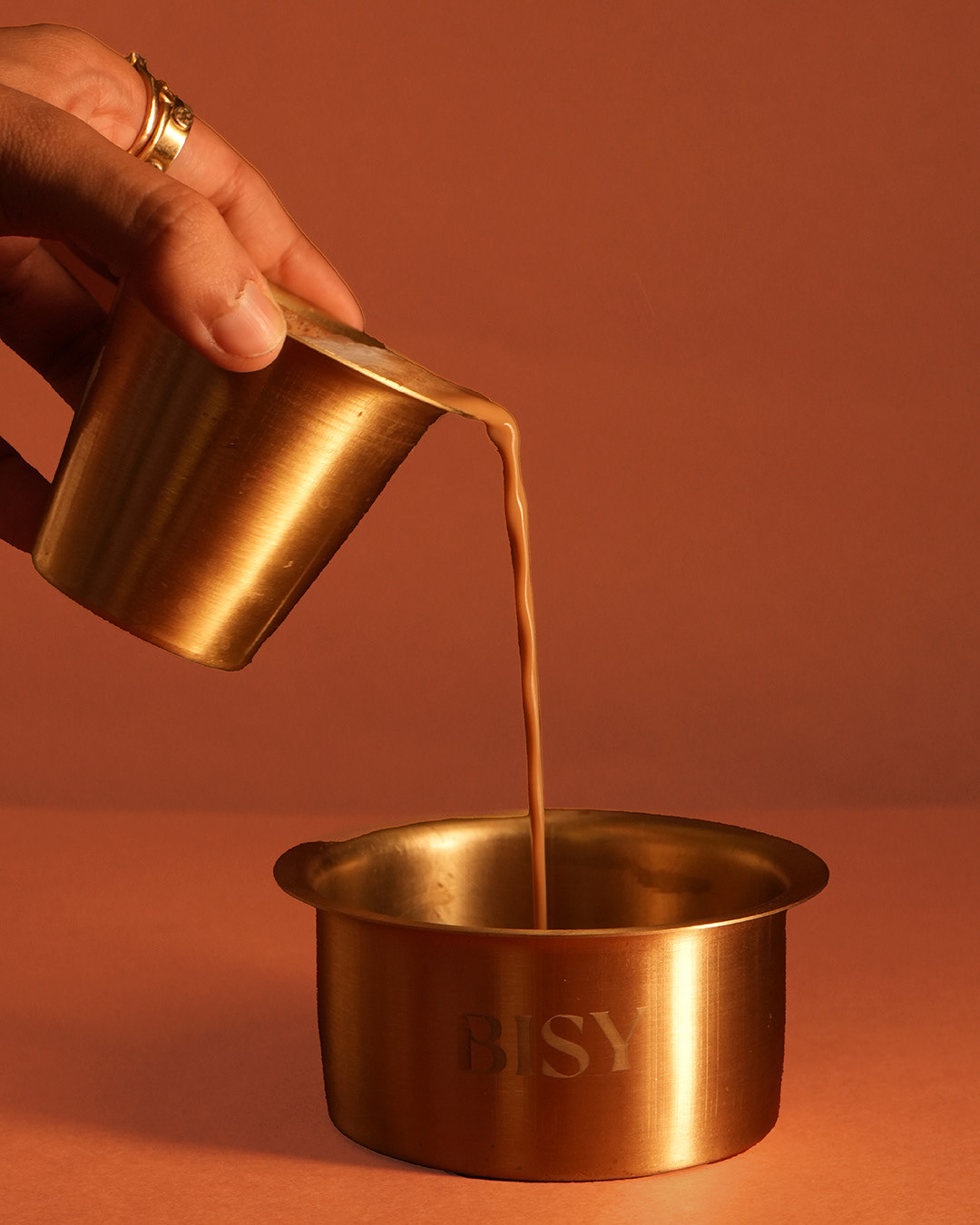
The colour palette is inspired by the colours of the south, deep terracotta, rich green, creamy coconut chutney and the warm shine of brass utensils.