Background & Brief
Established by sisters, Ariella and Rebekah Blank, Atmosphere Kombucha is an authentic & tasty probiotic drink that comes in a variety of yummy flavours.
The sisters are nutritionists and very passionate about clean eating and healthy living. They make the kombucha themselves while experimenting with fresh seasonal fruits and herbs to infuse with their healthy, probiotic tea. They envisioned the company growing and branching out into other products and services in the health and wellness market. They want to create a healthy ‘atmosphere’ for their customers.
Growing up in the lush green Himalayas, surrounded by fresh air and positivity, they are excited to bring parts of that stress - free mind set & clean lifestyle to the busy city of New Delhi. They really believe that food is medicine. It’s very inspiring to work with people who are so enthusiastic about their work.
The brief was to create their Brand Identity keeping in mind a clear bottle label design. They had been selling the homegrown kombucha at farmer’s markets in New Delhi but wanted to expand their market and start selling in some retail stores as well. They wanted a logo that will capture the idea of health, wellness and nature. The identity had to be young, hip and slightly whimsical.
Process and Sketches
All pictures are from the internet and for the purpose of a mood board only
I compiled a mood board and also searched the market for competition. I really wanted to include a leaf to show elements of tea and nature. I also wanted to include parts of their story of growing up in the spiritual mountains ranges of himalayas, if possible. Atmosphere by definition is 'the envelope of gases surrounding the earth or another planet' so I explored some circular sketches to kind of depict that.
Some initial sketches and ideas
Above and below: Initial concept drafts for the logo
After a few iterations, we decided that a symmetrical symbol like a mandala with leaves would work best for their company. A mandala is deeply associated with spirituality, balance and harmony.
Final Logo
The final logo is an interpretation of a mandala with a little atmosphere in the center. The leaves are clean and there are also drops of water in the logo. The colour palette is taken from the colours of Atmosphere Kombucha creating a soft, feminine and whimsical palette.
Packaging Label Design
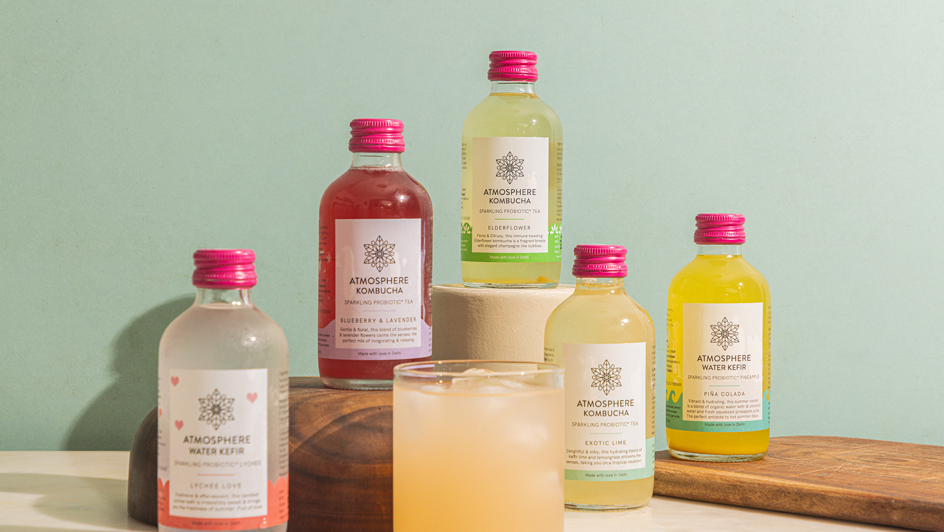
The label is a clear one, allowing the customers to see the fizzy goodness of the product. To differentiate the flavours, I used a strip of different colours and varying shapes.
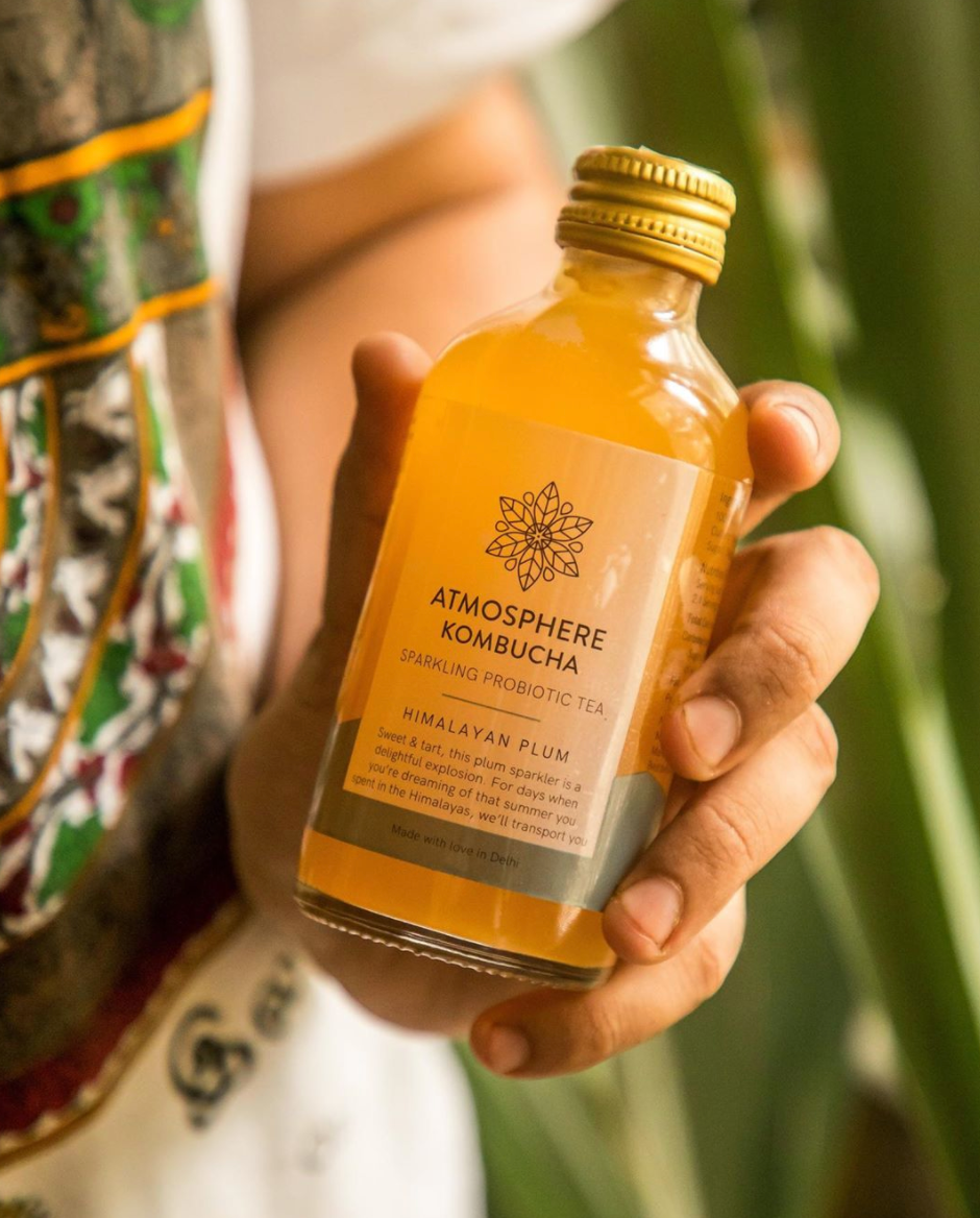
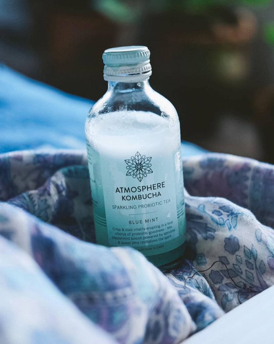
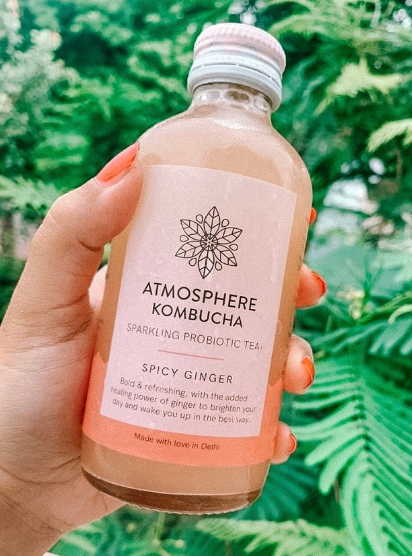
T-shirt design
Thank You!

