Brand Identity designed for May & Co. - a new homegrown brand that makes premium, artisanal and delicious syrups and shrubs for cocktails using real ingredients.
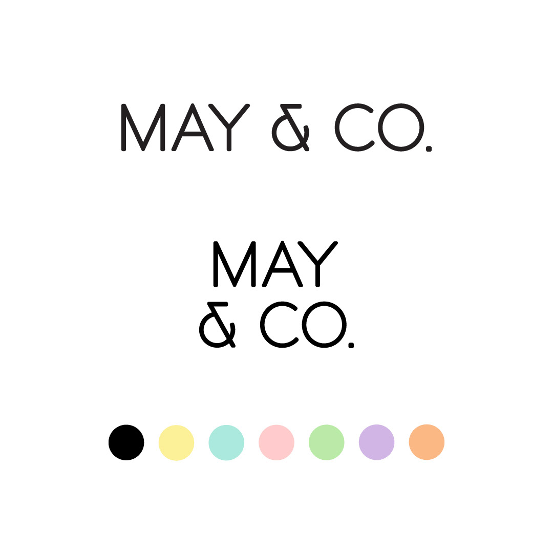
The client wanted very minimal and clean branding with a touch of quirk. We used a modern sans serif font for the logotype with an interesting ampersand. The angle of the line in the ampersand was then extended to create design elements that could be used throughout the brand identity and communication.
We added some bright, happy, almost neon colours to a predominantly black and white palette to give the brand a joyful vibe.
The entire look is clean and modern but with a touch of retro that we associate with classic cocktails, pubs and bars.
The entire look is clean and modern but with a touch of retro that we associate with classic cocktails, pubs and bars.

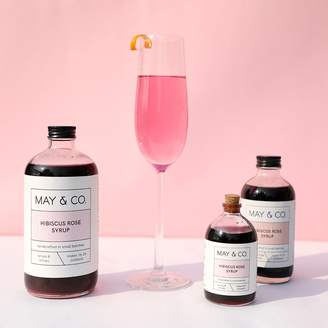
The packaging label is clean, legible and minimal. Each flavour has different colour stripes in the front, with the flavour name on top on the stripes.
We've also included two recipes for that specific product for the consumer to try on each label.
We've also included two recipes for that specific product for the consumer to try on each label.
The overall vibe of the brand is happy, cheerful and homely. Minimal with a touch of quirk.
360 degree view of the bottle


website homepage design - mobile version


